In the fast-paced world of value-based care (VBC), effective risk stratification is key to managing costs, improving patient outcomes, and optimizing resource allocation. As healthcare analysts and executives, we often grapple with fragmented data sources—claims, encounter, pharmacy fills, eligibility, and demographics—that make it challenging to identify high-risk patients early. That’s why I developed a custom risk stratification model and Tableau dashboard, transforming raw data into visual insights that drive actionable strategies.
As promised in my previous post, this post dives into the dashboard I’ve built and shared here. Whether you’re a fellow analyst looking to enhance your visualization skills or a leader seeking tools to refine your population health management (PHM), this dashboard offers a clear path forward. It’s designed to educate on building similar visuals while showcasing opportunities for customized implementations. Explore the visuals up close, and let’s connect if you’d like to adapt this for your organization.
The Foundation: A Robust Risk Model
Our model, implemented as a PostgreSQL view (risk_stratification), integrates key data elements:
- Conditions: Chronic (e.g., diabetes, hypertension) and behavioral health (BH) flags from ICD codes and medications for a rolling 15-month period.
- Medication Adherence: Flags for gaps >30 days in condition-related fills (last 12 months), now factored into scoring with customizable points.
- Utilization: Inpatient (IP), ED, and readmission flags.
- Other Factors: Age tiers, SDOH flags, rising risk (increasing IP/ED), and costs.
- Output: Member-level scores categorized as Low, Medium High.
Analysts: The view uses CTEs for modularity—e.g., drug_flags excludes isolated GLP-1s to avoid off-label diabetes inflation. Connect in Tableau or tool of choice for seamless viz.
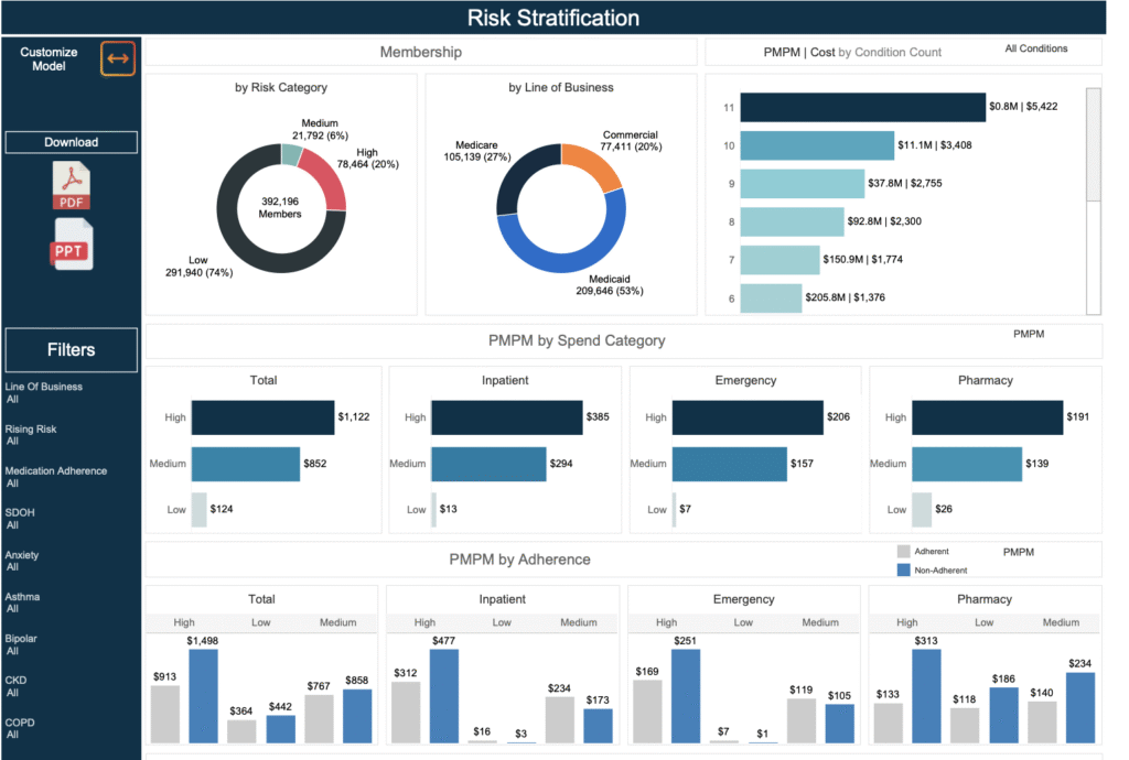
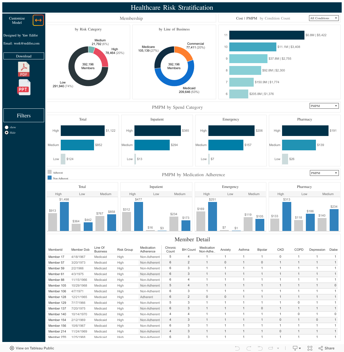
Dashboard Visuals: Focused Insights from the Dashboard
The dashboard emphasizes four core visuals, each highlighting different aspects of risk and opportunity. Built with filters for line of business and risk category, it’s interactive in Tableau but presented statically here for preview. Let’s break them down.
1. Risk Category Distribution (Pie Chart)
- What It Shows: A pie chart illustrating the percentage of members by risk category (Low, Medium, High), with counts.
- Why It Matters: Provides an at-a-glance view of population risk—e.g., if High dominates, it’s a signal for escalated care management.
- Analyst Tip: Use COUNTD(memberid) for size and risk_category for color slices. Add tooltips for adherence % to tie in compliance trends.
- Executive Insight: Segment by line of business to identify disparities (e.g., higher High-risk in Medicaid due to SDOH).
2. Cost Drivers by Risk Category (Bar Chart)
- What It Shows: Bars showing pmpm costs and total costs by spend categories (inpatient, pharmacy, ED). Watch out for heavy inpatient and ED usage among high risk populations.
- Why It Matters: Reveals financial hotspots—e.g., adherence gaps inflating pharmacy costs by 20% in High-risk groups.
- Analyst Tip: Stack measures like AVG(inpatient_cost); add a dual-axis line for chronic_count + bh_count to correlate conditions with spend.
- Executive Insight: Use to forecast savings—targeting ED in Medium-risk could reduce overall costs by 15%.
3. Cost Drivers by Medication Adherence
- What It Shows: Bar charts showing pmpm costs and total costs by med adherence cohort and spend categories (inpatient, pharmacy, ED).
- Why It Matters: Reveals financial hotspots—e.g., adherence gaps inflating pharmacy costs by 20% in High-risk groups.
- Analyst Tip: Convert adherence flag to dimension and alias groups as adherent/non-adherent
- Executive Insight: Prioritize these cohorts for outreach—potentially averting millions in escalations.
4. Detail Table
- What It Shows: Member-level views with all flags utilized in the model.
- Why It Matters: Allows for quick identification of members in a category of interest
- Analyst Tip: include cost metrics, chronic condition counts, bh condition counts, and individual conditions to help end user assess members. Provide filters for all of those.
- Executive Insight: Focus on high-risk, non-adherent members for integrated interventions and enrollment into care management programs.
These visuals are filterable (e.g., by adherence, conditions)
For Analysts: Replicate and Innovate
This dashboard is your blueprint! Start with the SQL view, import to Tableau, and customize:
- Adherence Enhancement: Use LAG for gap detection; filter by drug_classes tied to conditions.
- Pro Tips: Parameters for score thresholds; sets for top-cost members. Experiment with % adherence calcs for deeper compliance analysis.
- Build Challenge: Try modifying detail table for member-level views!
For Executives: Strategic Value and Opportunities
Incorporating medication adherence scoring and social determinants of health elevates this dashboard from descriptive to prescriptive—e.g., flagging gaps helps prevent exacerbations, potentially saving 10-15% on pharmacy/ED/inpatient costs. In my work, tools like this have helped reduce utilization by targeting High-risk + adherence cohorts.
What are your thoughts on this dashboard? Comment below or connect work@redifor.com—I’m excited to hear how it fits your VBC needs.